page-header

Clean Education

  • Data Gathering
  • Data Analyzing
  • Visual Storytelling
  • Data Visualization
  • 3D modeling
  • Infographics
  • NC Open Data
  • Microsoft Excel
  • Adobe Photoshop
  • Adobe InDesign
  • Keyshot

Design Task

This was a project was for the graduate level studio GD502: New Information Environments. We were tasked with finding two disparate data sets that had no direct causation with each other and find a possible correlation with the aim to tell a lie. While this is not what is desired in the real world; this was a creative, playful and mischievous exploration of form with how data can take on an interesting shape to tell story. Some of the constraints of the project were the data had to come form North Carolina and the data needed to be visualized in 2D, 3D, and (optionally) 4D.

Design Process

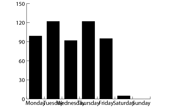
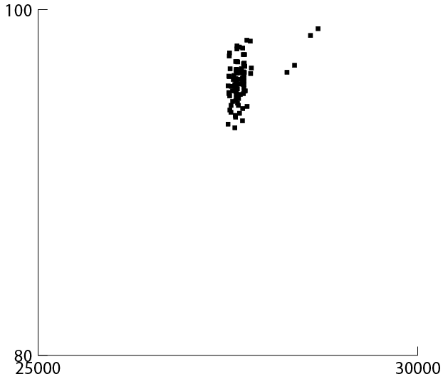
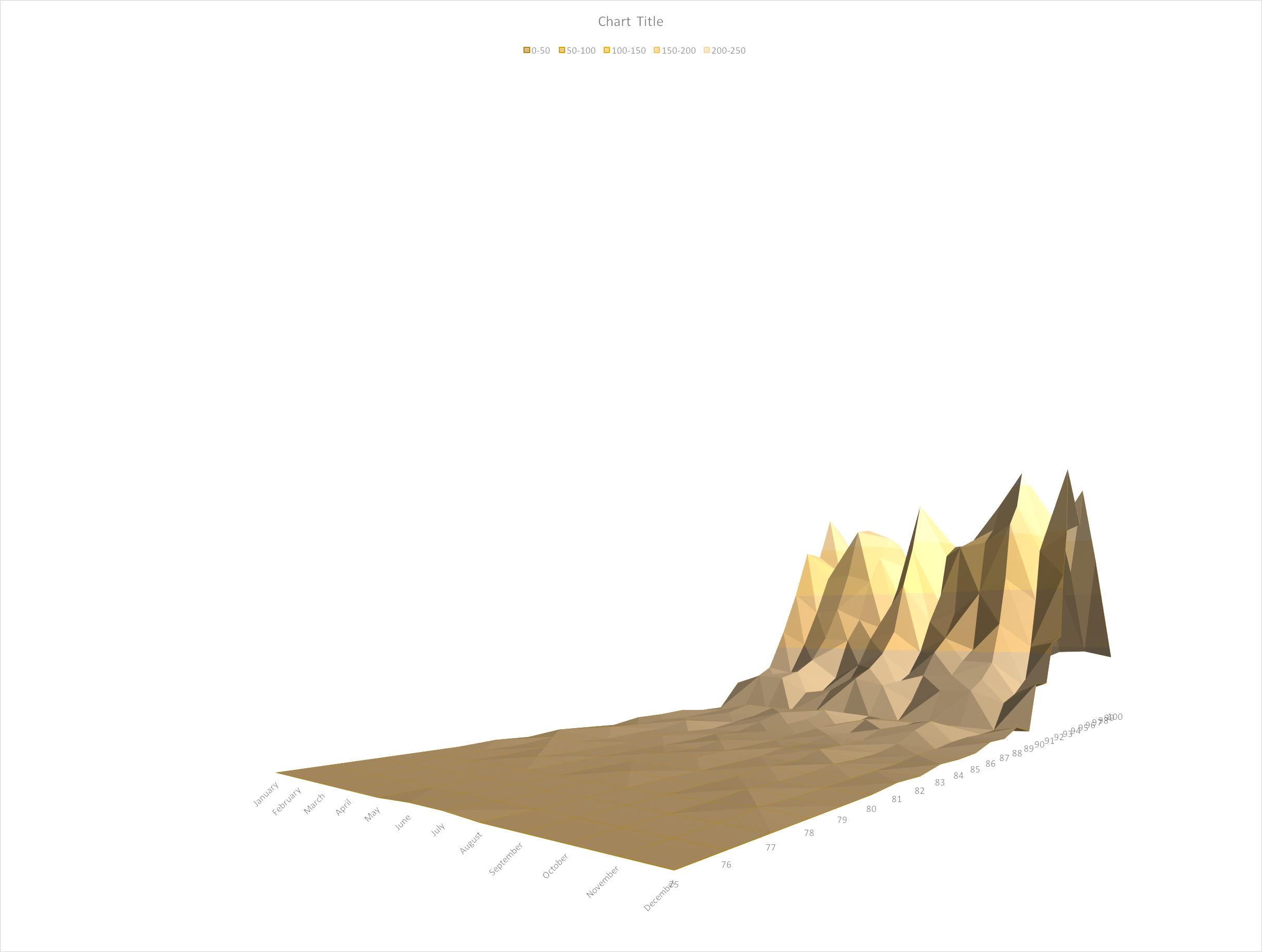
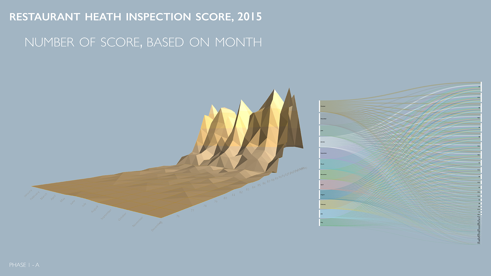
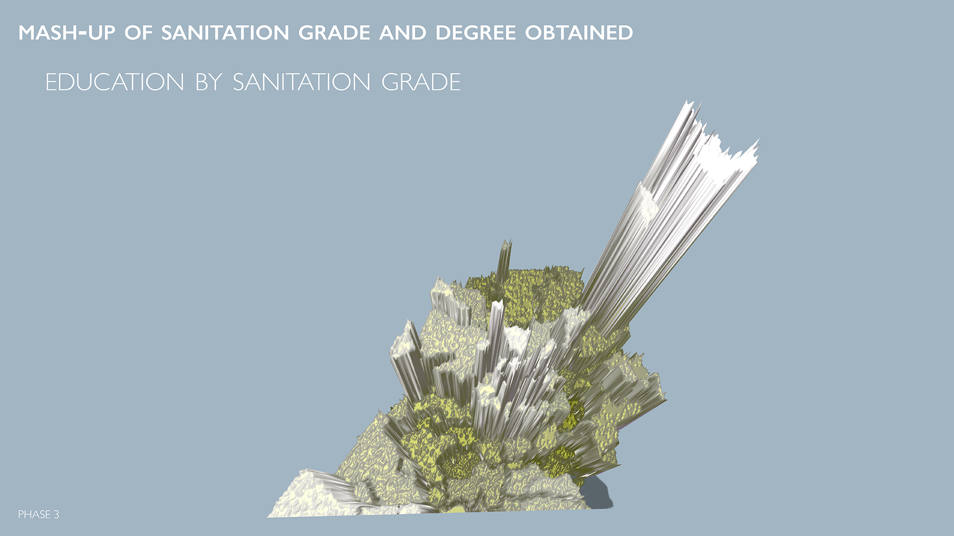
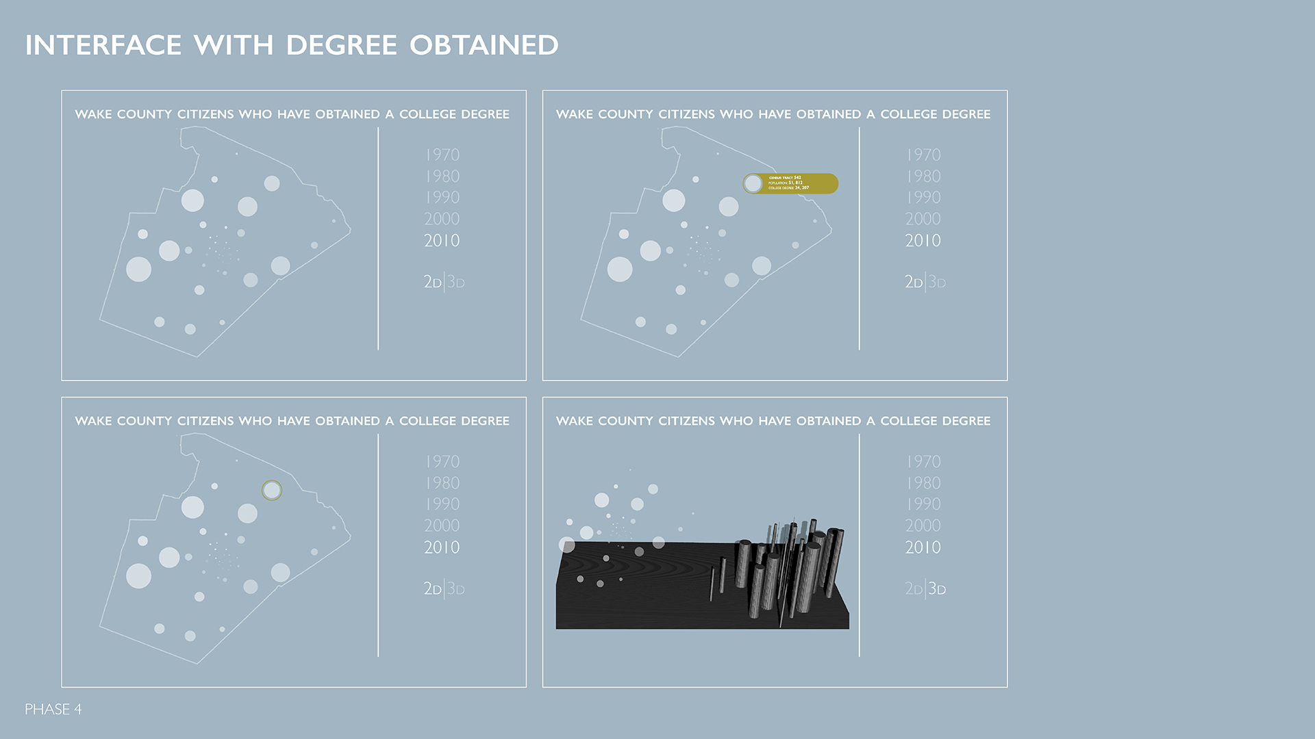
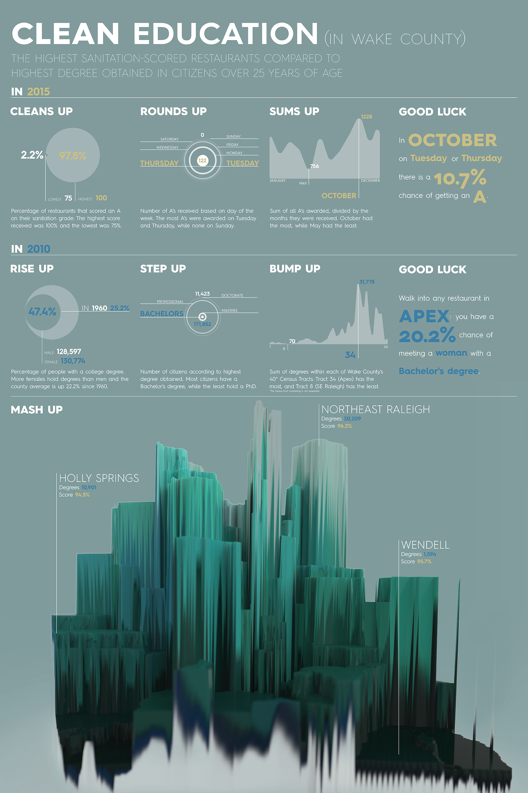
We began looking at data through Microsoft Excel. It was in here we used their simple graph creator tool to get an idea of what trends we could see. As we learned our story, we switched over to other creation tools like Adobe Illustrator. Some students in the class explored the data through Google Sketch-up, Processing or the javascript library, D3. I used my industrial design background to create a bump-map in Adobe Photoshop to extrude my data out. I rendered the model in Keyshot.

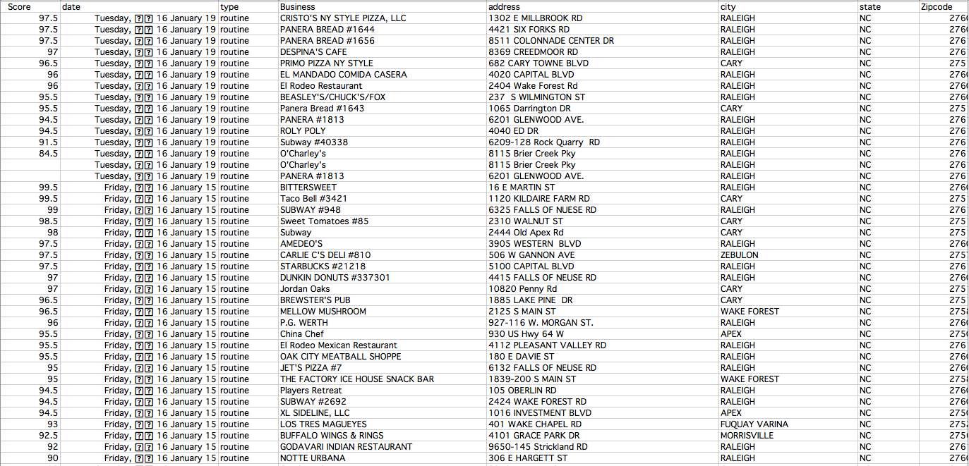
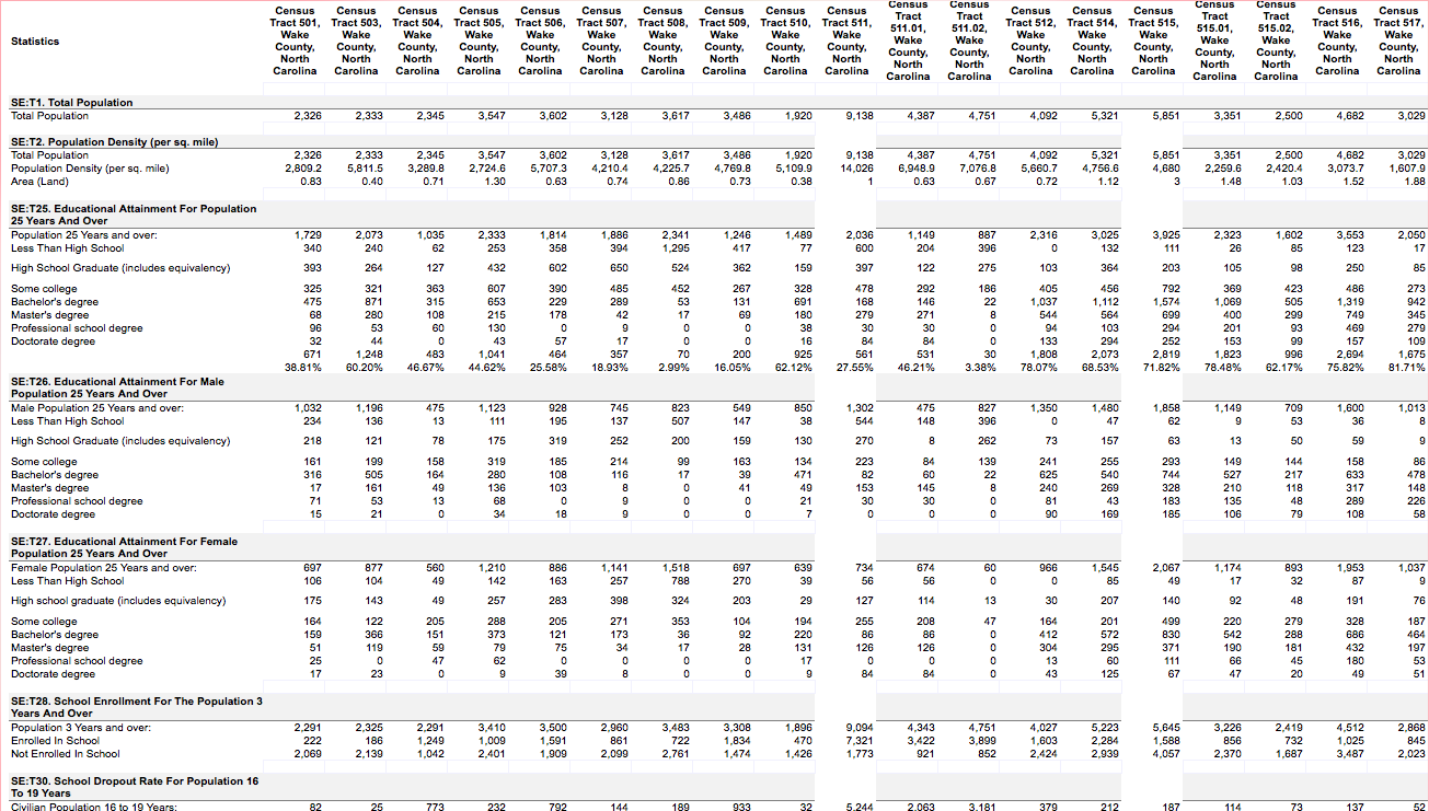
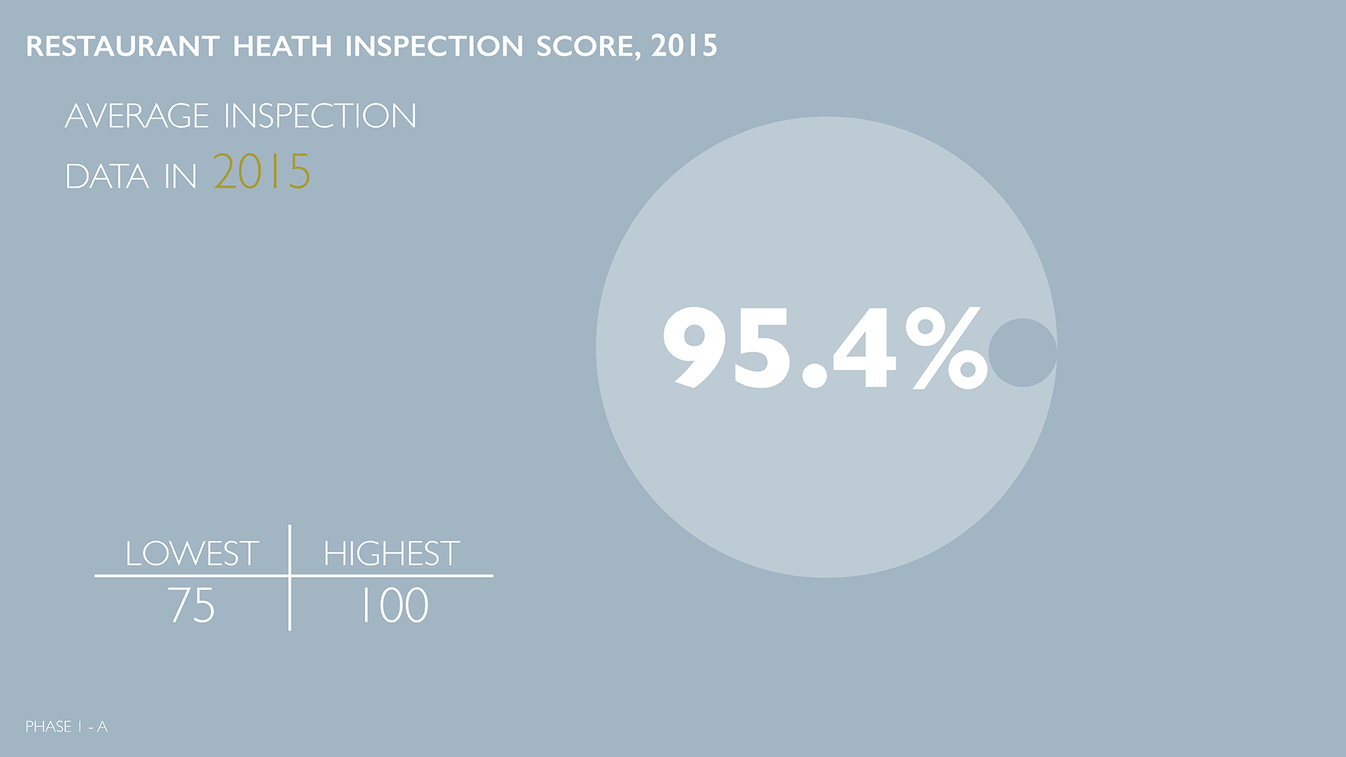
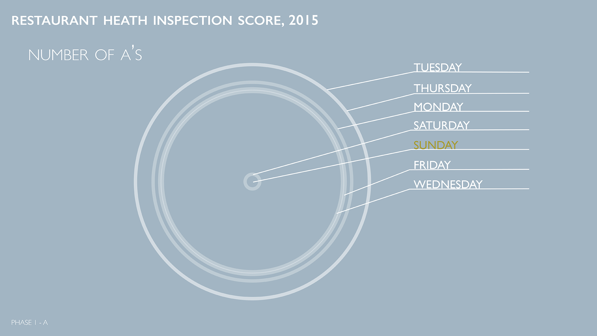
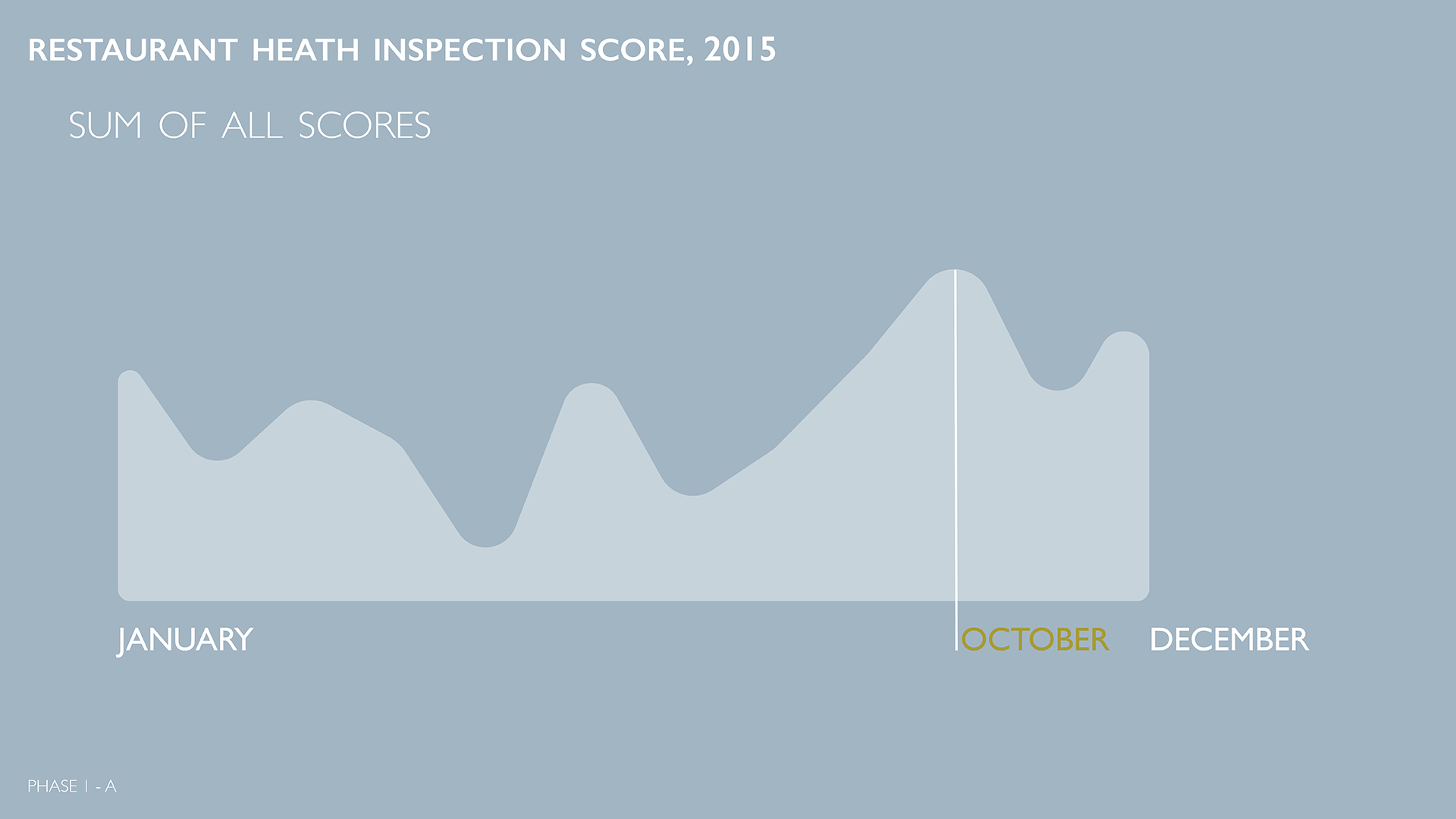
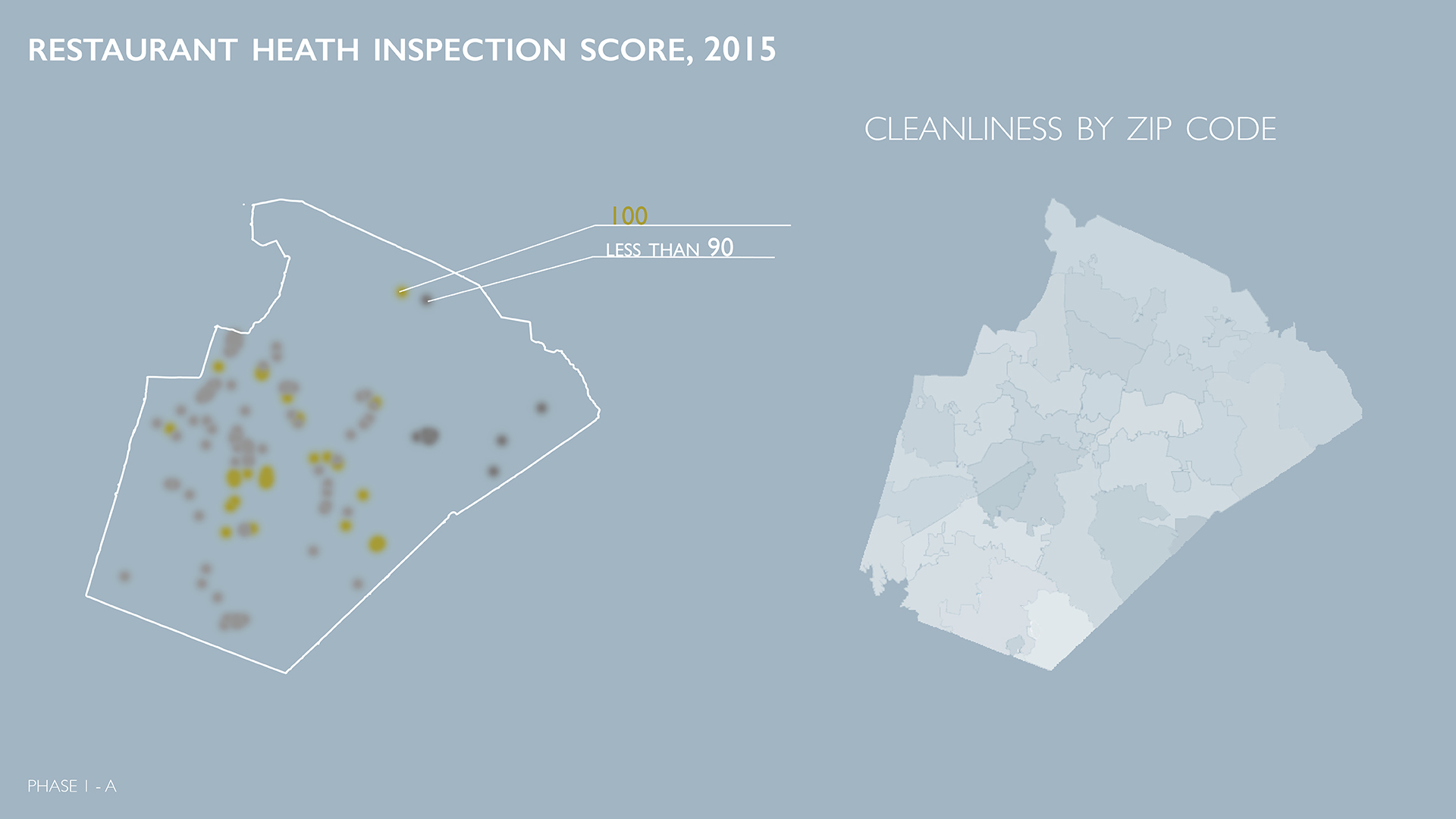
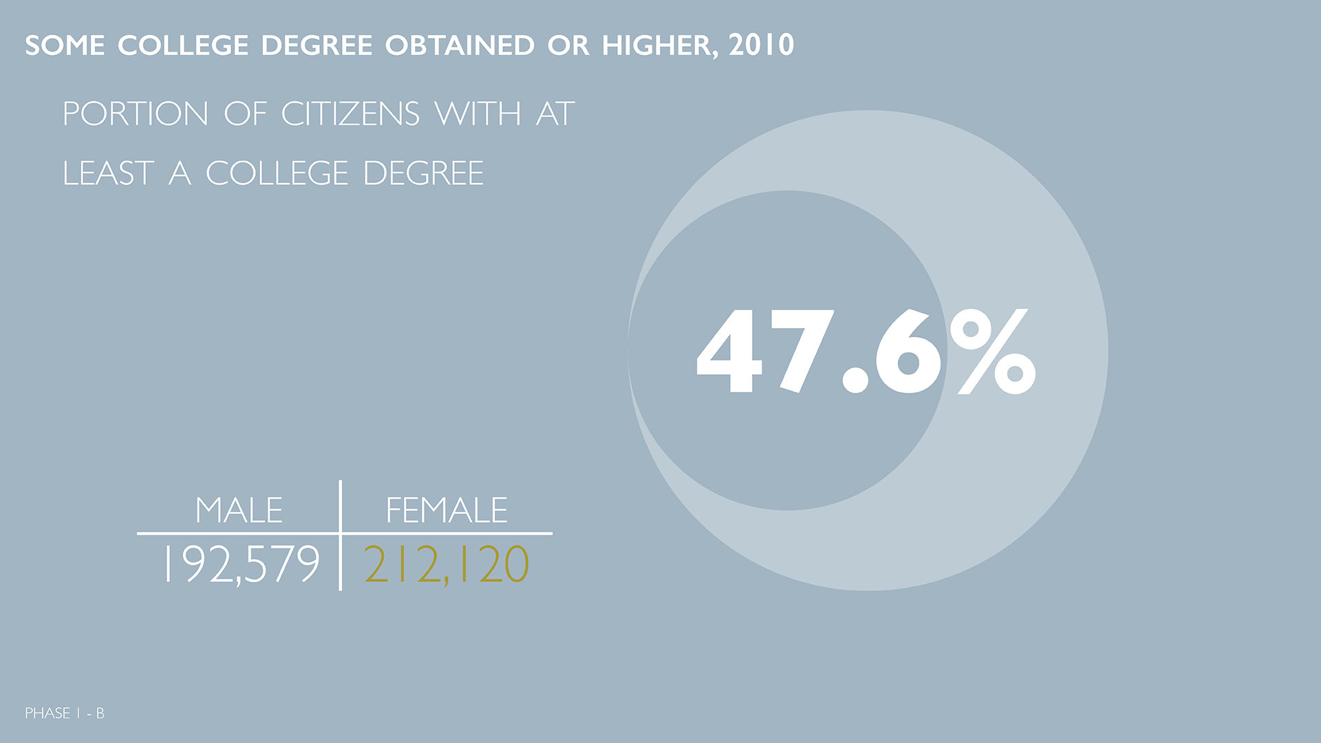
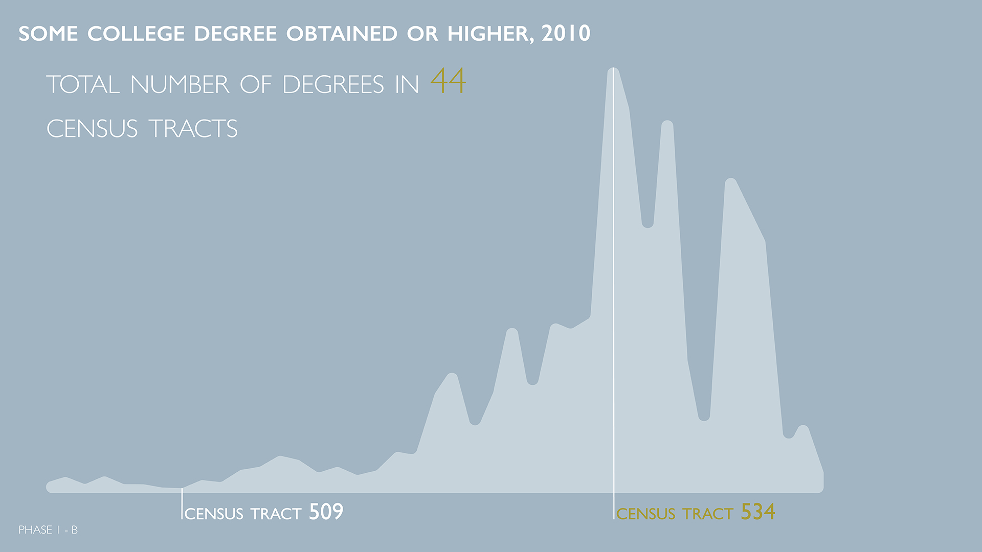
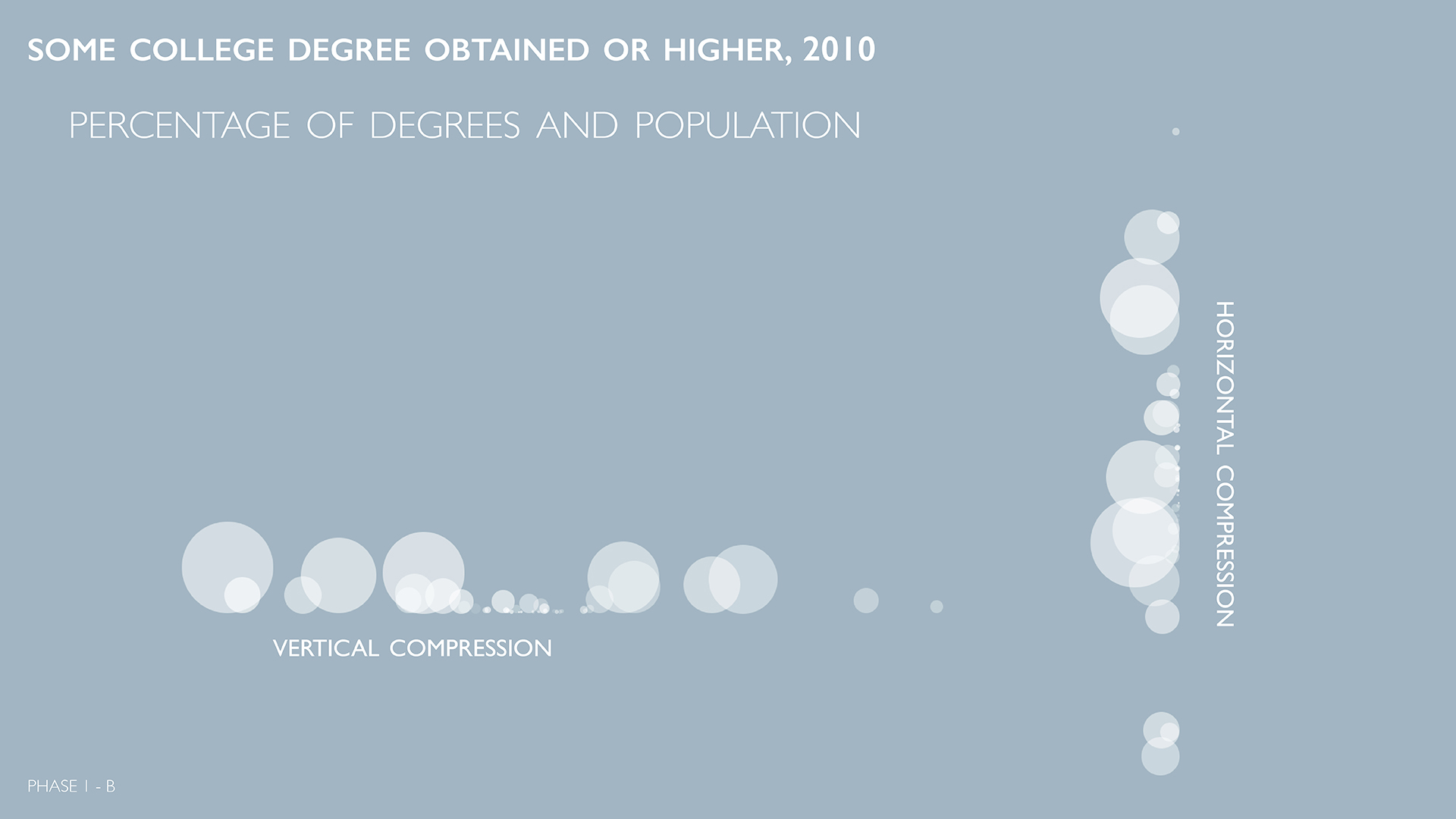
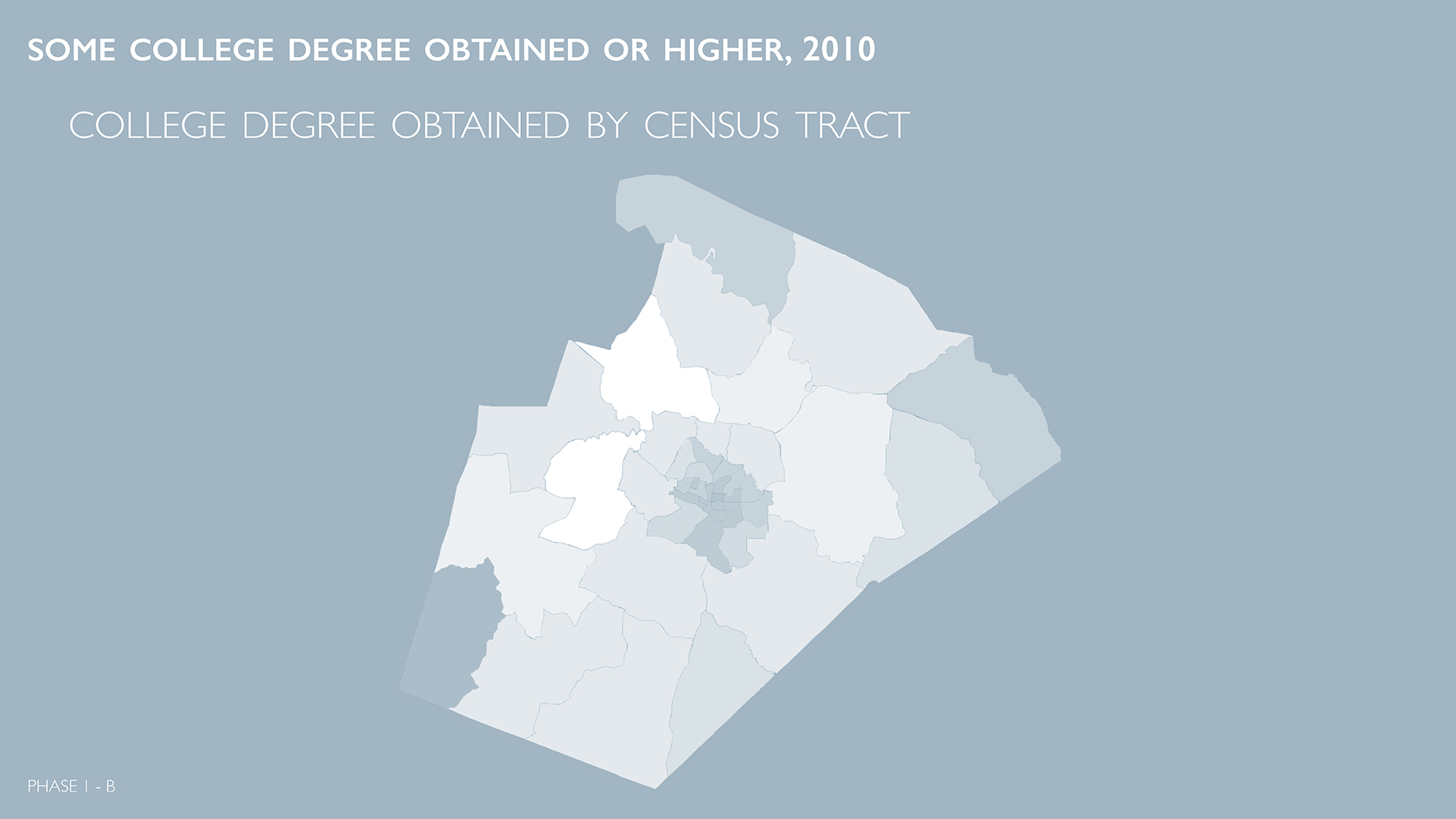
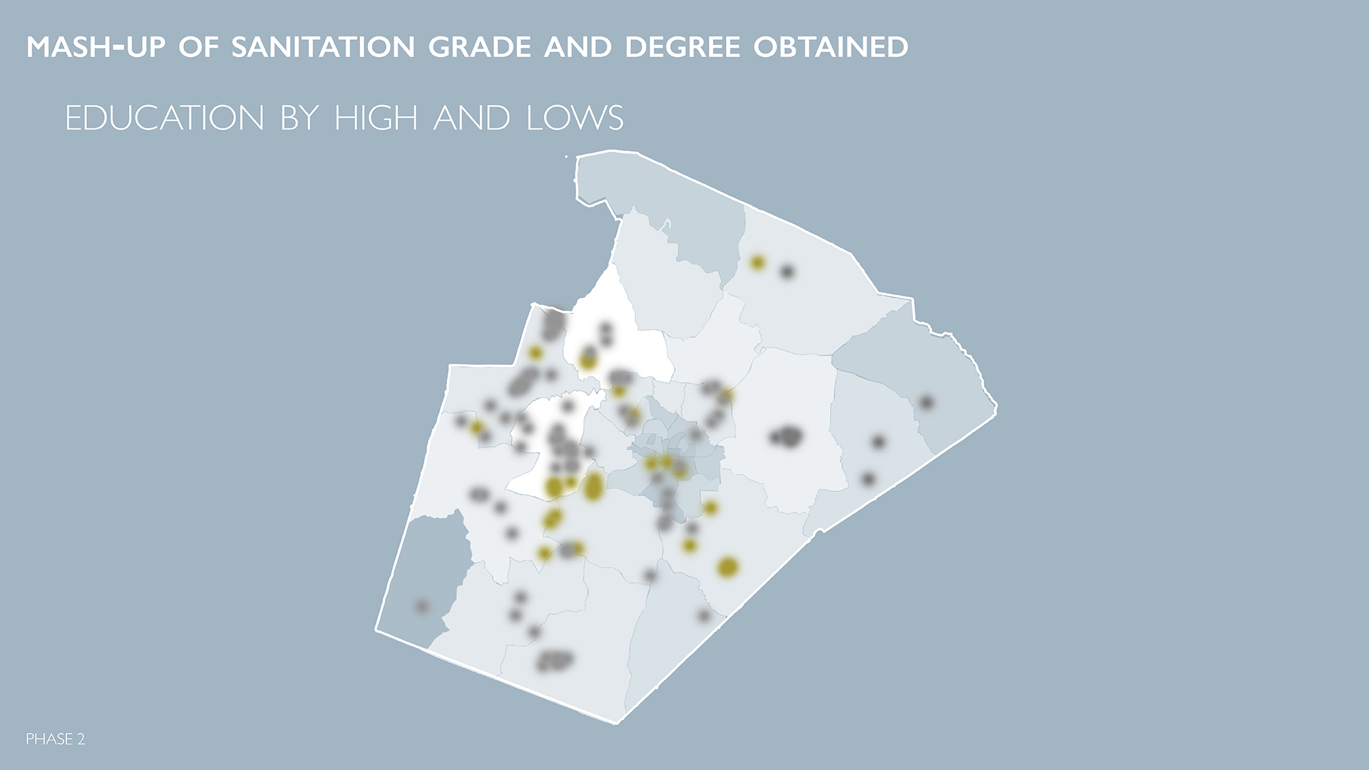
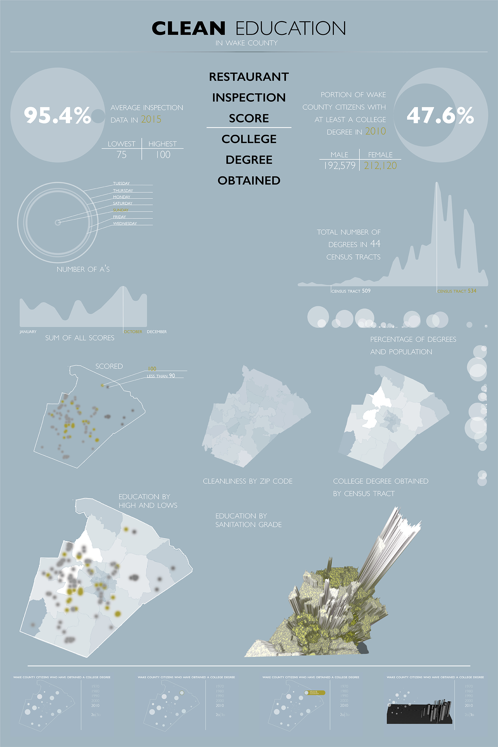
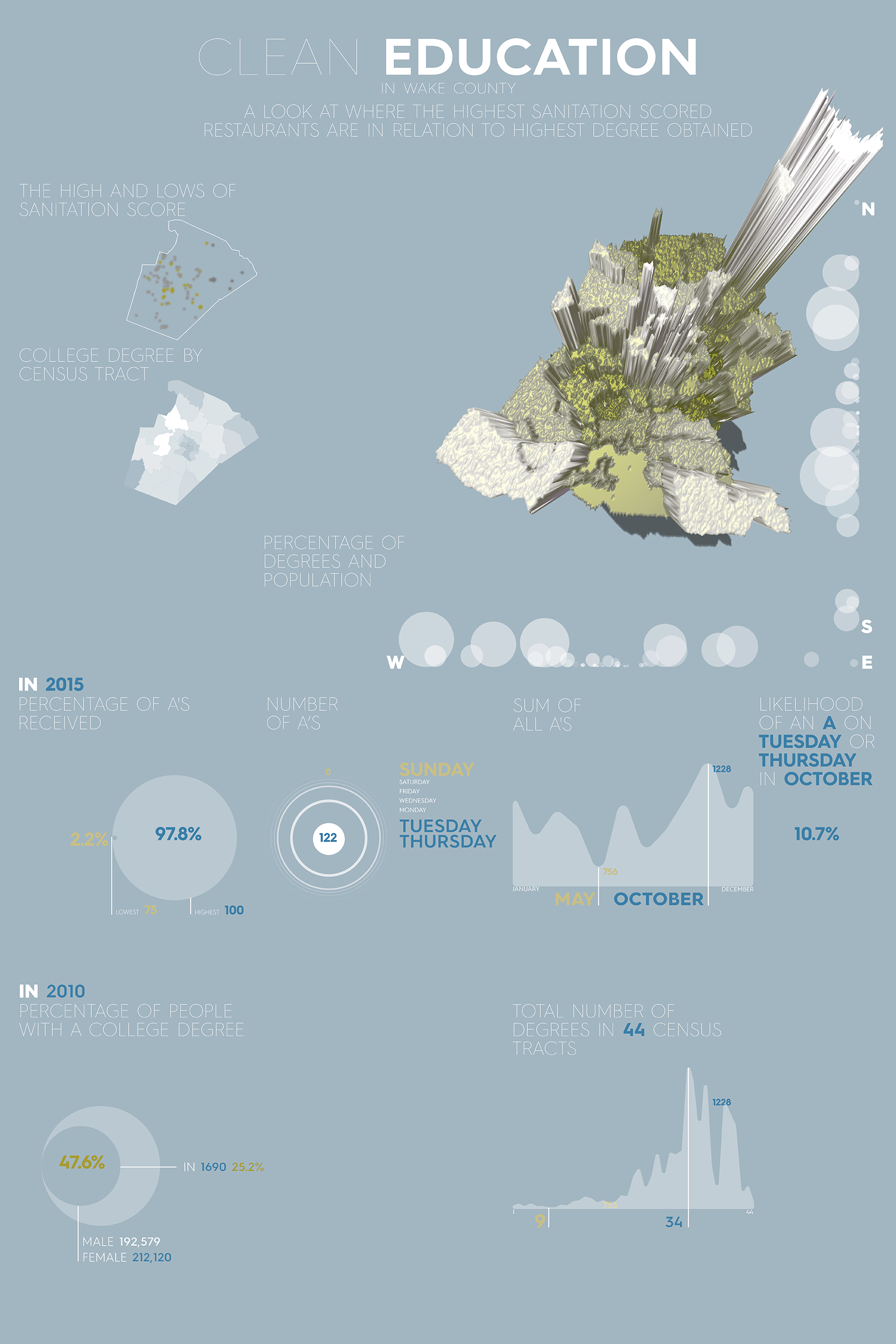
There was a lot of back and forth with this process of finding what the story really was. For example, in one data set I had over 12,000 rows with over 50 columns. I had a lot to sort through to figure out what I wanted to actually look out. One thing that I discovered is that to tell there story there needed to be a constant between the two data sets. One of the initial constraints was the data had to come from North Carolina, so I chose to narrow down mine to Wake County. I used that location as my commonality, so any geo-location data would fall within that similarity. The other thing was getting the numbers to have some similarity. I used percentages to explore how one area compares to another. Below I go more into what this meant.

  • Restaurant Data

  • Education Data

  • Sanitation by Day of the week 1

    Sanitation by Day of the week

  • Sanitation by Day of the Week

    Sanitation by Day of the Week

  • Sanitation by Day of the Week

    Sanitation by Day of the Week

  • Sanitation by score and value

    Sanitation by score and value

  • Sanitation by Month and Score

    Sanitation by Month and Score

  • Title

    Title

  • Sanitation Score 1

    SanitationScore1

  • Sanitation Score 2

    SanitationScore2

  • Sanitation Score 3

    SanitationScore3

  • Sanitation Score 4

    SanitationScore4

  • Sanitation Score 5

    SanitationScore5

  • Education 1

    Education1

  • Education 2

    Education2

  • Education 3

    Education3

  • Education 4

    Education4

  • Mashup

    Mashup1

  • Mashup 2

    Mashup2

  • Mashup 3

    Mashup3

  • Poster 1

    Poster 1

  • Poster 2

    Poster 2

  • Poster 3

    Poster3

Clean Education

My two data sets came from Wake County Open Data and Census data for Wake County obtained from SocialExplorer.com.  One data set was the Restaurant Sanitation Grade and the other was Highest Degree obtained.

During the 2D Phase, I explored modernistic design style to show what stories I could possible pull out of the data. For the Sanitation scores, I looked at what days of the week and month resulted in what grades, and what areas of wake county resulted in what grades. For the education data set, I looked at how gender played a role, how degrees compared against themselves, and what areas did those people live.

For the 3D phase, I created a bump-map in Adobe Photoshop and extruded the data out. The data was overlayed on-top of itself in a form of shades of gray. If there was high grades or high average sanitation scores it was depicted as white. Low would be black. There was only 1 area within the data set that there weren’t any data for and that was RDU airport and Umstead Park. In the 3D model there is just a hole in the shape of that region. The extrusion had spikes when the degree percentage didn’t line-up with the sanitation percentage. There aren’t any areas with huge disparities though, like many degrees and low sanitation scores or visa versa.

The story that I ended up finding was clean restaurants correlates with highly educated people. Maybe their cleaner foods results in smart people.  While that seems kind of preposterous, to think about that is kind of amusing.

What happens next…

In my exploration, I did not get a chance to explore the 4D phase of this project. I would love to see how this bump map might change from year to year. From some preliminary research showed that the zeniths would get taller. This reflects the already overall shape that when viewed from the side looks like a city-scape, so when incorporating time, the city would grow and get taller. The goal would be as time passes the form would become a solid shape with no peaks nor valleys but I’m not sure how long that will take.

A turnable Render of my 3D mash-up.
Use your mouse or finger on touch-sensitive display to rotate around it.