page-header

VR Word Search

  • Content mapping
  • User Experience mapping
  • User persona development
  • User research
  • VR iOS Mobile Development
  • Empathy through Play
  • Mind Node
  • Adobe Illustrator
  • Adobe Indesign
  • Unity3D
  • Xcode

Design Task

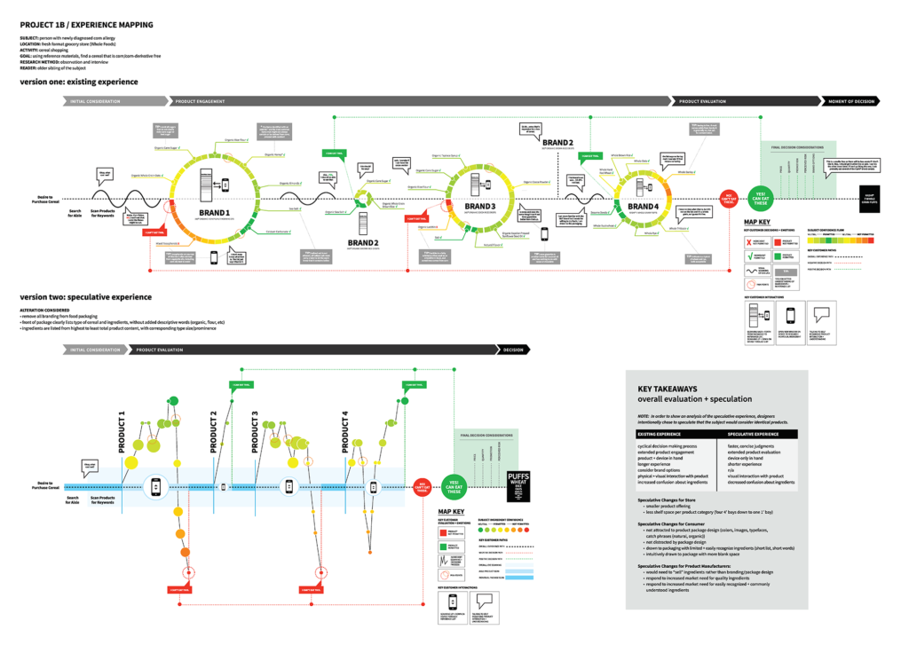
As part of a greater series of projects in a semester devoted to Design as a Cognitive Artifact, we researched and looked what defines a food system and how our experiences and motivations effect our activities with objects related to the food system. This specific portion was related more towards user experience and flow charts as a way of exploring the activity and emotions tied to this. After that, we were asked to make a speculative intervention to the design of something in the activity and detail how that would effect a given users experience. An additional constraint to the presentation was that our user experience map needed to have a logical audience that was not our given user. This was to dictate what visual language we used to represent and detail the interactions.

Design Process

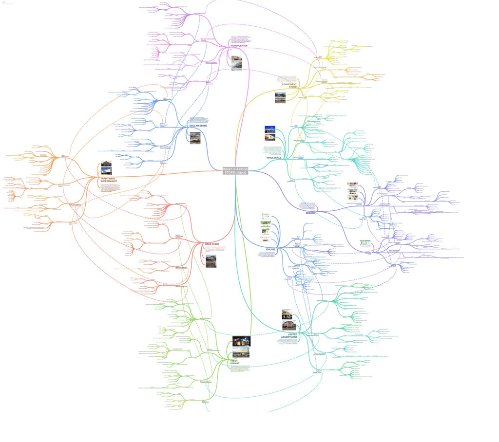
Given this was a second part, this portion was just after we mapped out qualities of a food system.

Team Members: Amber Ingram, Rachael Paine, Anantaya Wonaphotimuke

From that, my team and I decided that we were going to explore the experience of someone who just found out that they had an allergy. One of my teammates has a cousin with a corn allergy and after further research learned that that allergy creates a great hardship when going grocery shopping in the story if they are looking for any processed food.
VR Word Search

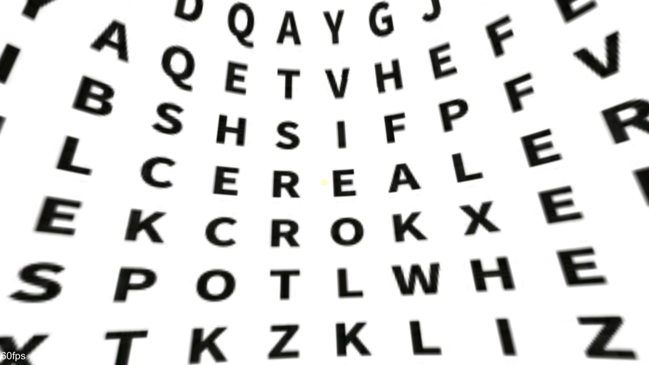
In the exploration, we were asked to experiment with how the experience can be represented. As part of the assignment, the experience map needed to be aimed at perspective audience. Ours was the sibling of the inflected with the corn allergy. The more technical map was aimed at an older sibling. I wanted to think of way to relay this information to a younger sibling. In my final year, my research took a look at how play is used in design and reflectively how design can be used to play. With that in mind, I experimented with how forms of play might be a way to represent a users experience. This is how I reached the idea of a word search. Throwing the idea of a word search on it’s head a little, it’s easy for a viewer to get lost in all the letters. This was a way to show how all the aisles and labels can be overwhelming for someone who doesn’t necessarily know what they are looking for. On top of that, once they find something, the user has to go through each ingredient and figure out what they can and can not eat. The user did this by looking at the phone and then again at the box, for this reason, I represented the word bank to be on a medium that takes the person out of VR.

For the intervention, my group and I explored how something that would strip the labels away and bring the idea of it’s ingredients front and center. The brand would be identifiable by its ingredients, not its pictures or colors. To represent this in a word search, we brought it back to the more conventional method to show the even playing field that users now have.

What happens next…

Technologically speaking, I would want to make the word search more functional. A user would be able to actually have the agency of picking its letters rather than predefined circles. Conceptionally speaking, how a user explores the word search needs some work. The method of delivering the words is flat and falls short of giving a deeper way to experience the map.

Recording of the Word Search in VR
On an iPhone 7 Plus
User Experience Map
  • User Experience Map

    Experience Map before and after intervention

  • Design Intervention

    Speculative Design Intervention

User Experience as Represented in a Word Search
  • Word Bank for VR

    Word Search bank for in VR

  • Intervention Word Bank 1

    Word Search as part of Intervention

  • Intervention Word Bank 2

    Word Search in Intervention