page-header

Our Taste

  • Print Design
  • Print Layout
  • Print Systems
  • Digital Systems
  • Interactive Magazines
  • Adobe Illustrator
  • Adobe InDesign
  • Adobe TypeKit

Design Task

This assignment was for Information and Publishing Design Systems. We were tasked with creating a print and digital publication as an exploration of how systems can be robust and defined enough to allow for a variety of content as well as utilizing the affordances of the medium they are consumed in. We began first with the print publication and then moved into the digital publication. The digital publication was used in the now deprecated Digital Publishing Suite as part of Adobe InDesign.

Design Process

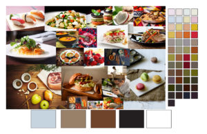
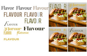
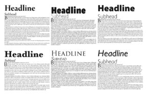
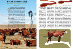
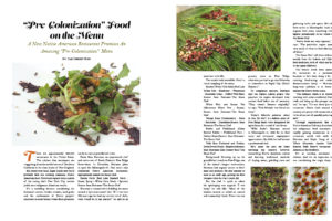
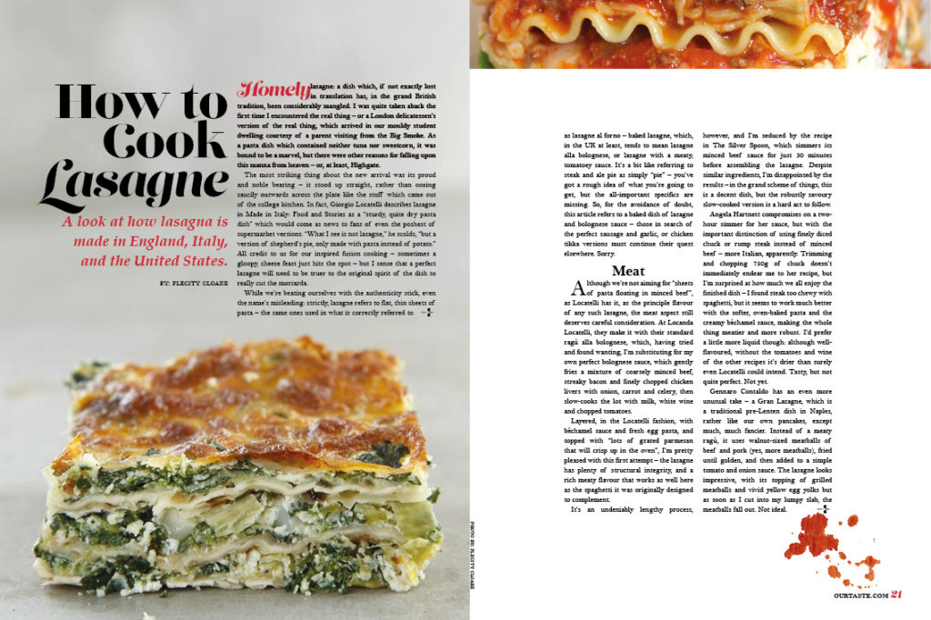
I began with an interest in food and how a food changes as it travels from culture to culture. This began when I first found out that Chicken Parmesan is actually an American creation, in Italy they mainly just use eggplant. From that interested, I searched for articles that could possible fit into the magazine I was creating. From there I explored possible type treatments that would be associated with a food magazine. This took me looking at a variety of current magazines on the rack as well conceptually think about who the reader would be. William Sonoma and Home & Garden were two of the many magazines that I took inspiration from. Below are my explorations in look and feel and as well as layout.
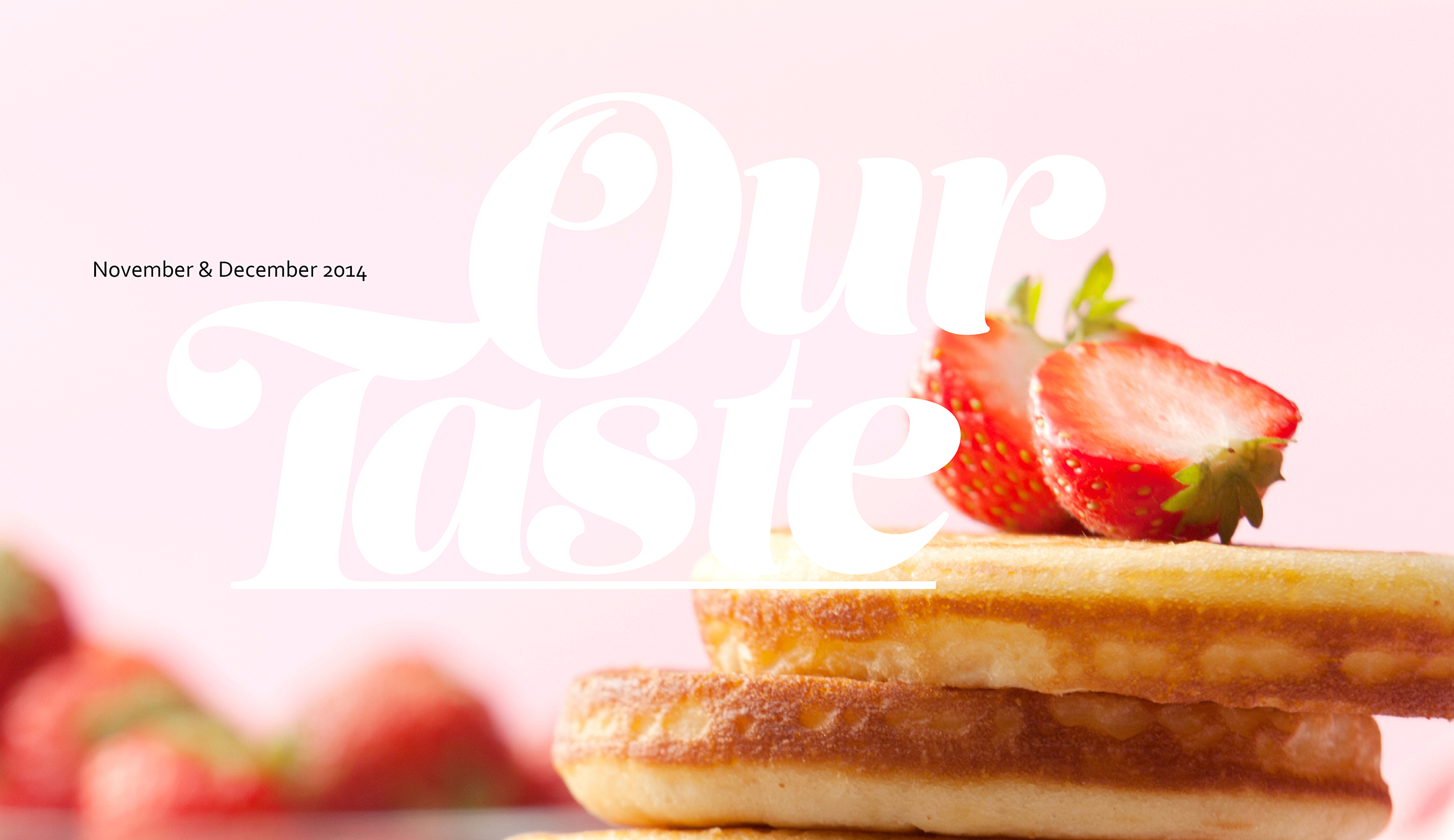
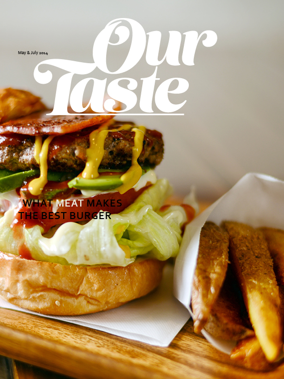
Cover Variations
  • 1

  • 2

  • 3

  • 4

Developing the Look and Feel
  • Color

  • Masthead

  • Copy

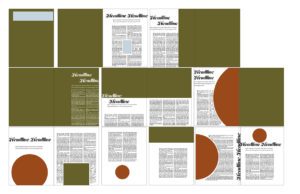
  • Layout Blocking

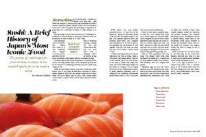
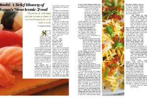
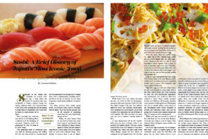
Developing Article Layout
  • Sushi - 1

  • Sushi - 2

  • Sushi - 3

  • Beef

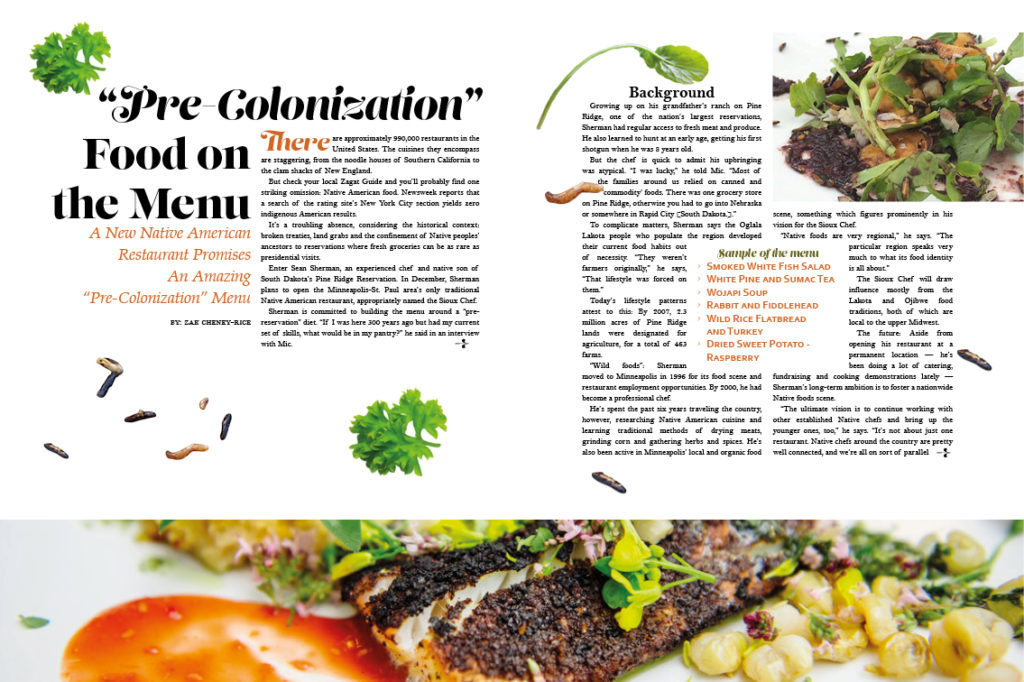
  • Indigenous

Our Taste

My design solution is called Our Taste. I chose that because how we as a culture will change the flavor or ingredients of a dish to fit their own taste buds. While we mare share foods, everyone as their own taste.

The print publication walks the line of participation and education. Cooking and eating are fundamentally communal processes. Historically people would come together to share, make, dine and converse together. It through these actions I wanted to reflect in my design system solution. In the Table of Contents I reference the sections as Sides and Features, thinking about how course. Sides are the participatory side of the magazine. Readers would be able to bring what they share. Like any dinner part, the host would supply the main course which in this case would be the feature stories and articles. The features are surrounded around that issues theme. Given the nature of the publication, I foresaw this as a bi-monthly publication, adding up to 6-7 issues a year.

The digital publication looked at the affordances of viewing the publication on a tablet. It used the concept of cards to move from one story to another and to dig deeper into an individual story. This stands in contrast to the pagination technique that some digital magazines still use today which are just a direct translation of a printed magazine that is viewed online. Another important of the digital publication, it gave readers a direct line to participate with the publication. One way I explored this was letting users to take pictures of their dishes on the recipes page that would ideally then be auto-added to an array of user-driven content.

What happens next…

The biggest thing that would push this publication forward would be to flush out the content and explore how that content pushes the design even further. One aspect of the digital publication that I would want to try is how AR or VR would later how a user engages with the material. Much of VR readers look at digital versions of books or a card based system in a virtual environment but how might this material be accessed in a more spatial context.

Developing Article Layout
  • TOC

    Table of Contents

  • Recipes

    Recipes

  • Article

    Article: Indigenous Food

  • Feature 1

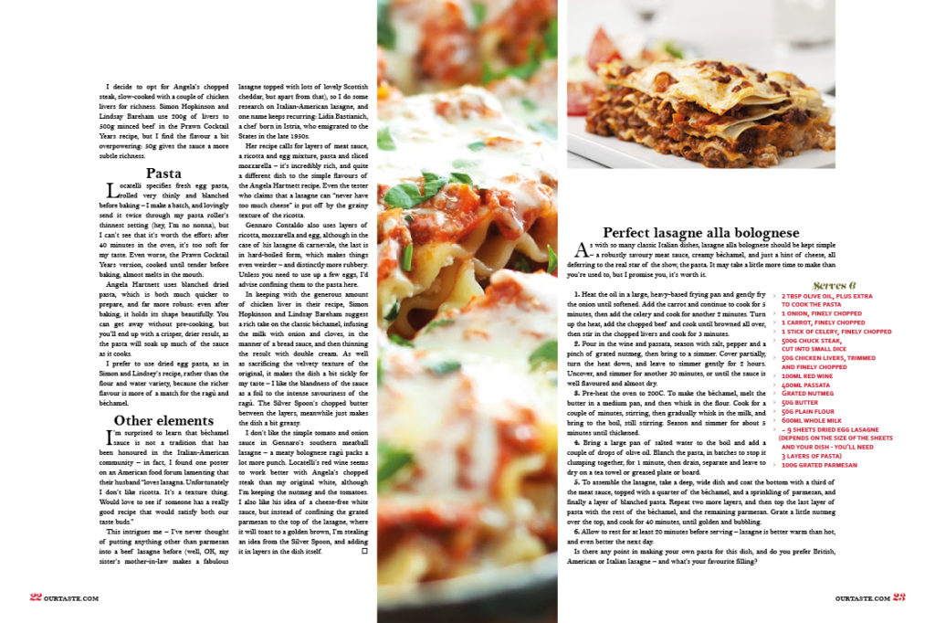
    Feature: Lasagna

  • Feature 2

    Feature: Lasagna

Digital Publication
Made in InDesign Digital Publishing Suite, previewed on iPad