Voice of SECCA
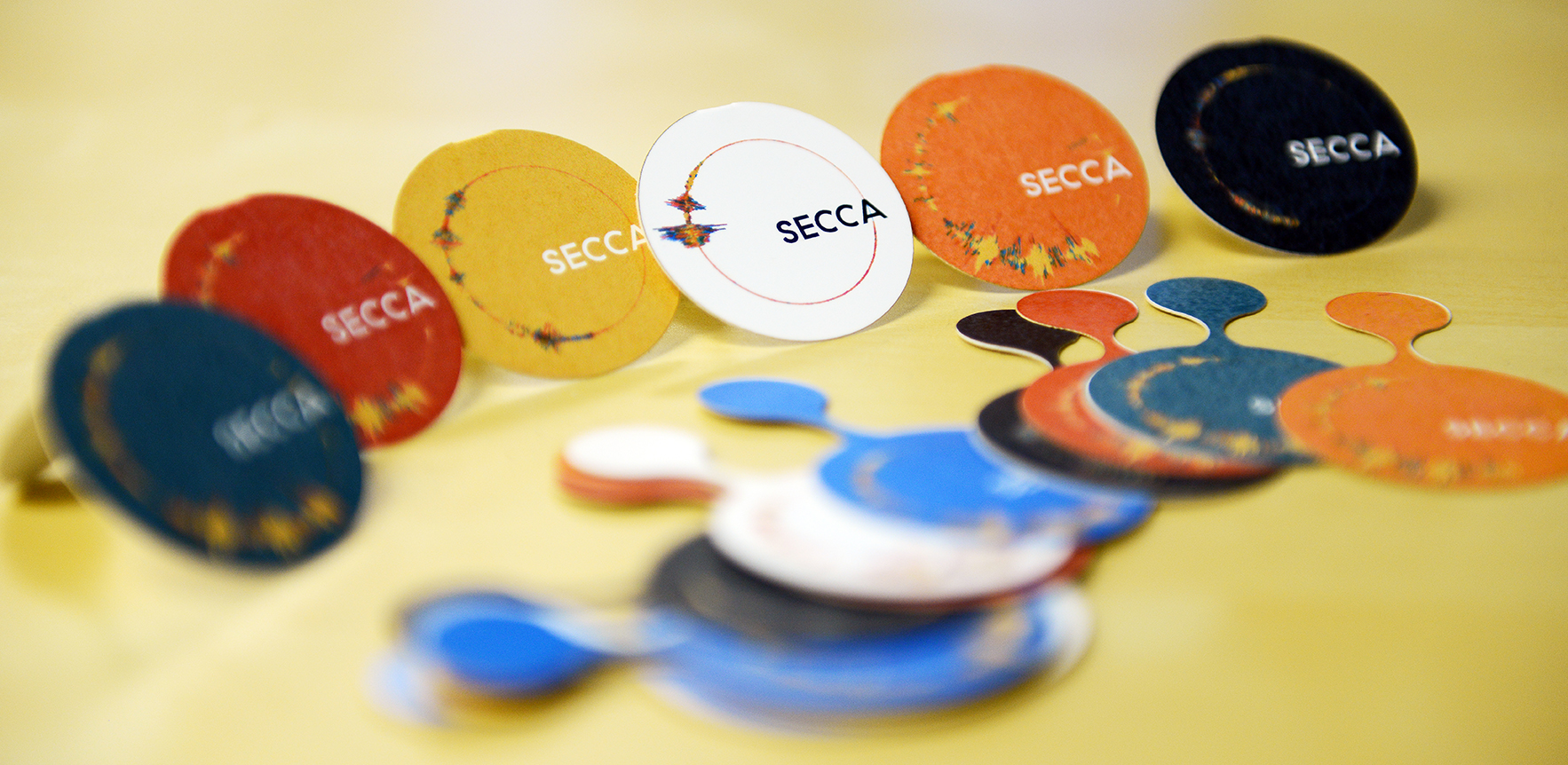
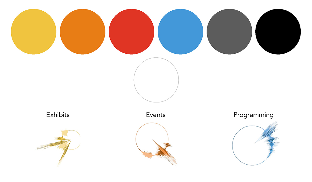
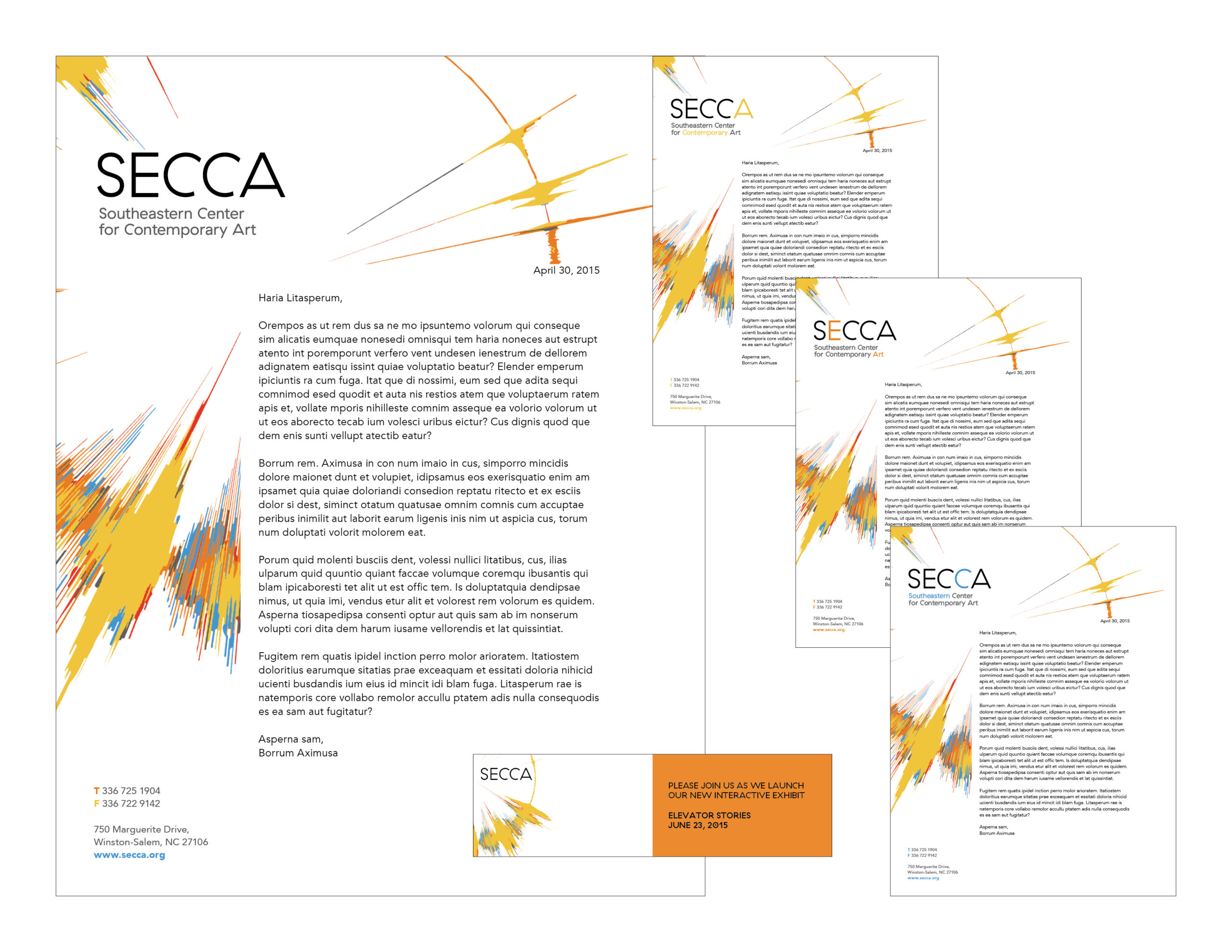
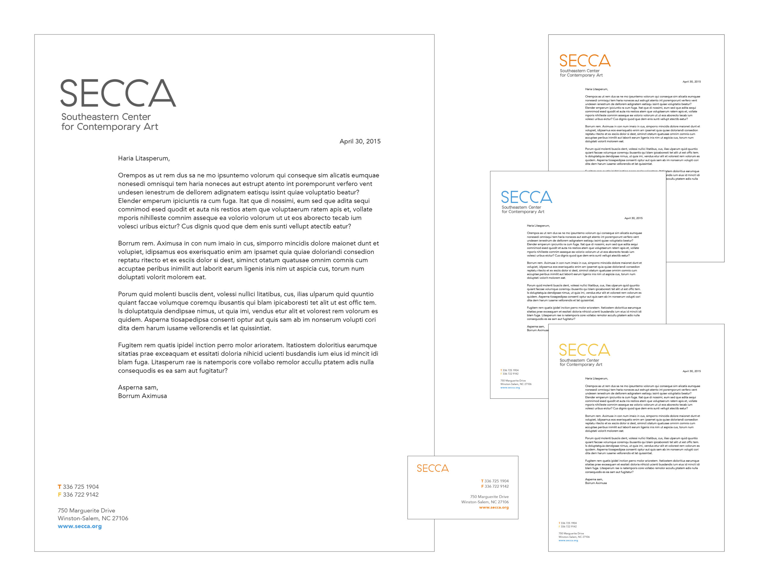
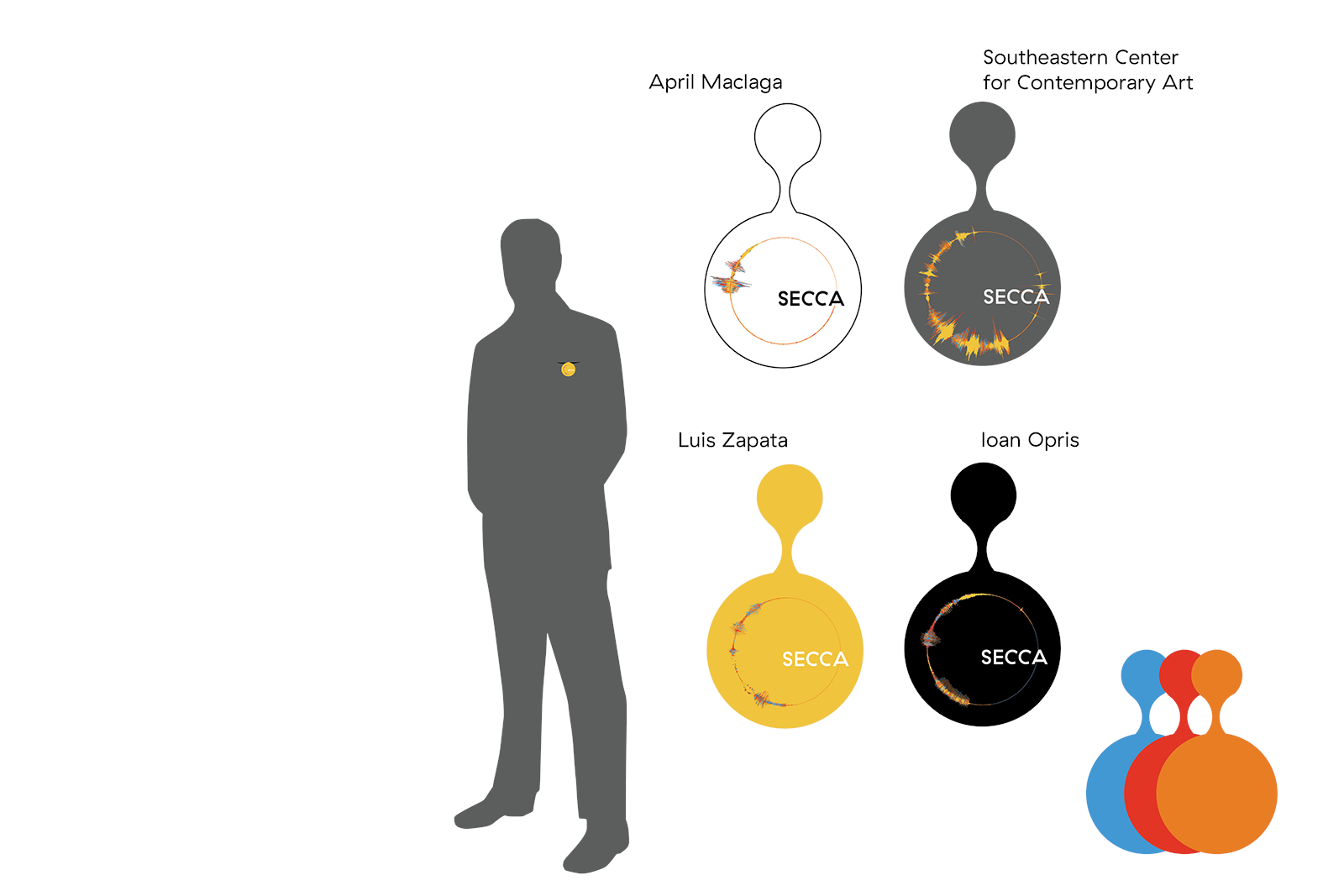
Our design solution centralizing on the idea of how SECCA provides a voice for the artist and community as well as add a listening ear to various avenues. We visual represent this with a waveform that has been formed into a circle. The waveform is audio clip of someone saying “Southeastern Center of Contemporary Art.” Each color in the waveform represents different layers of the center and how they all support each other. This concept is then supported in the other areas of branding, like stationary by each department having a color. Also, to include the two parts of a dialogue, speaker and listener, there is a set of stationary with a much louder presence of the brand and a much softer or quieter presence of the brand. This is included in mailers, business cards, and other forms of outward facing material.
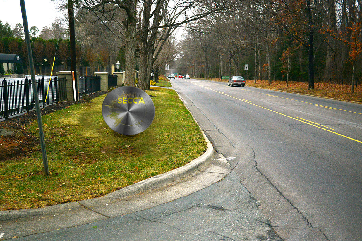
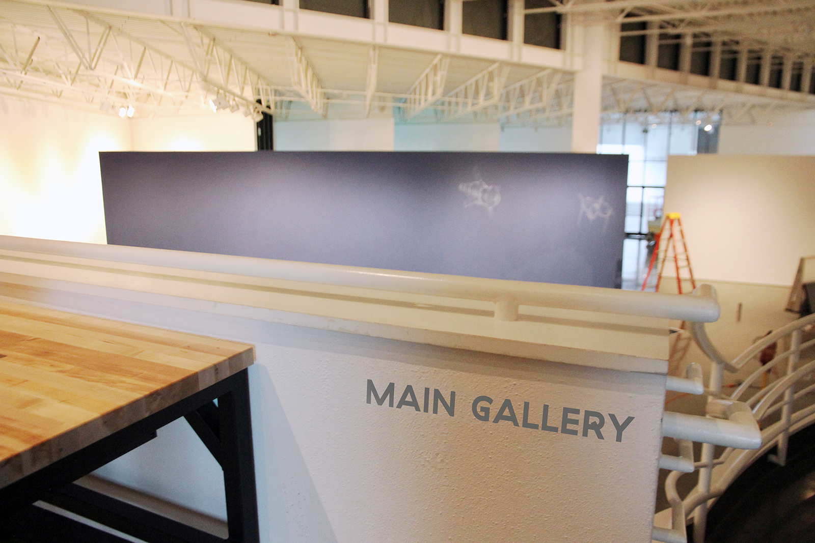
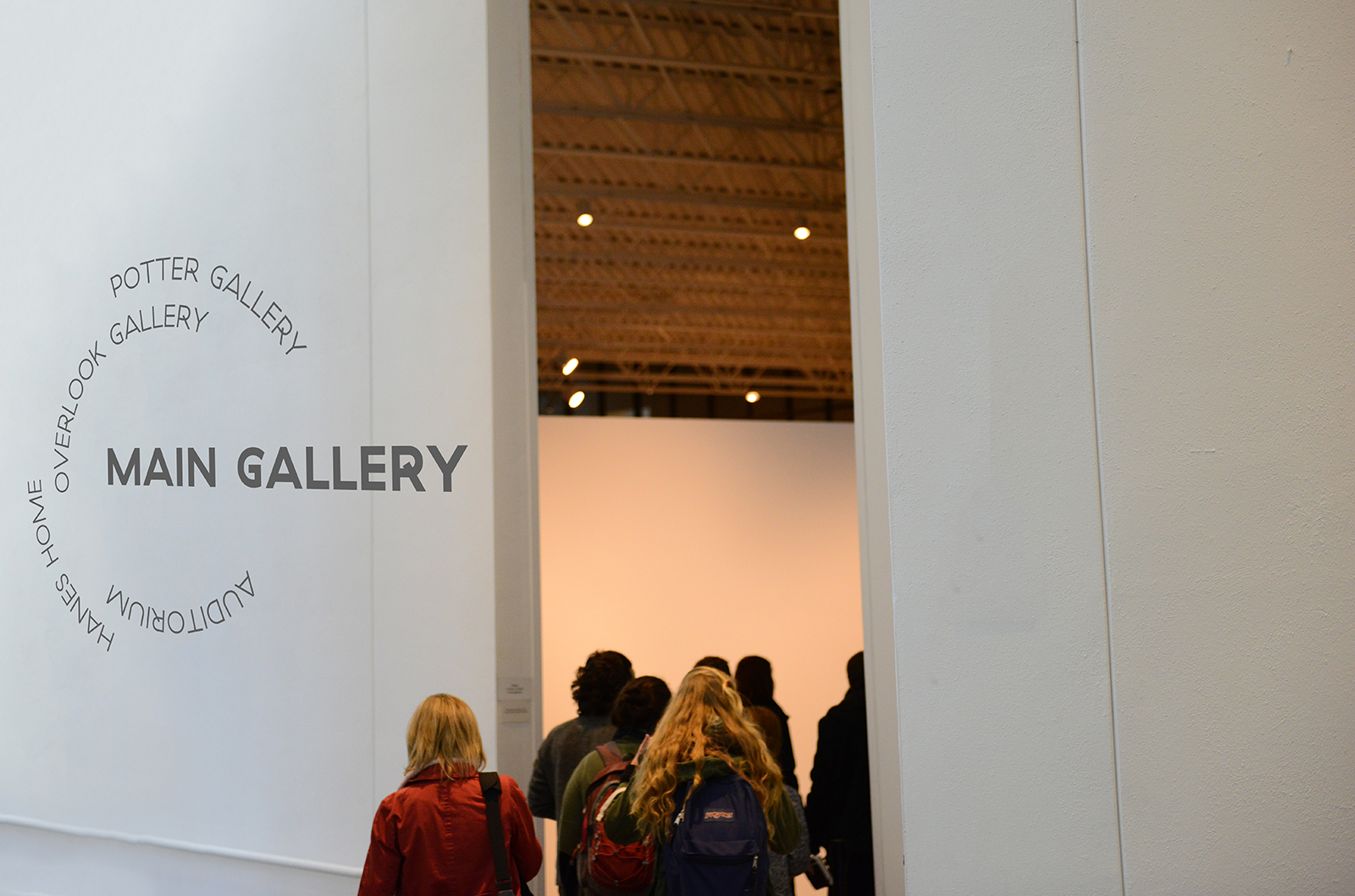
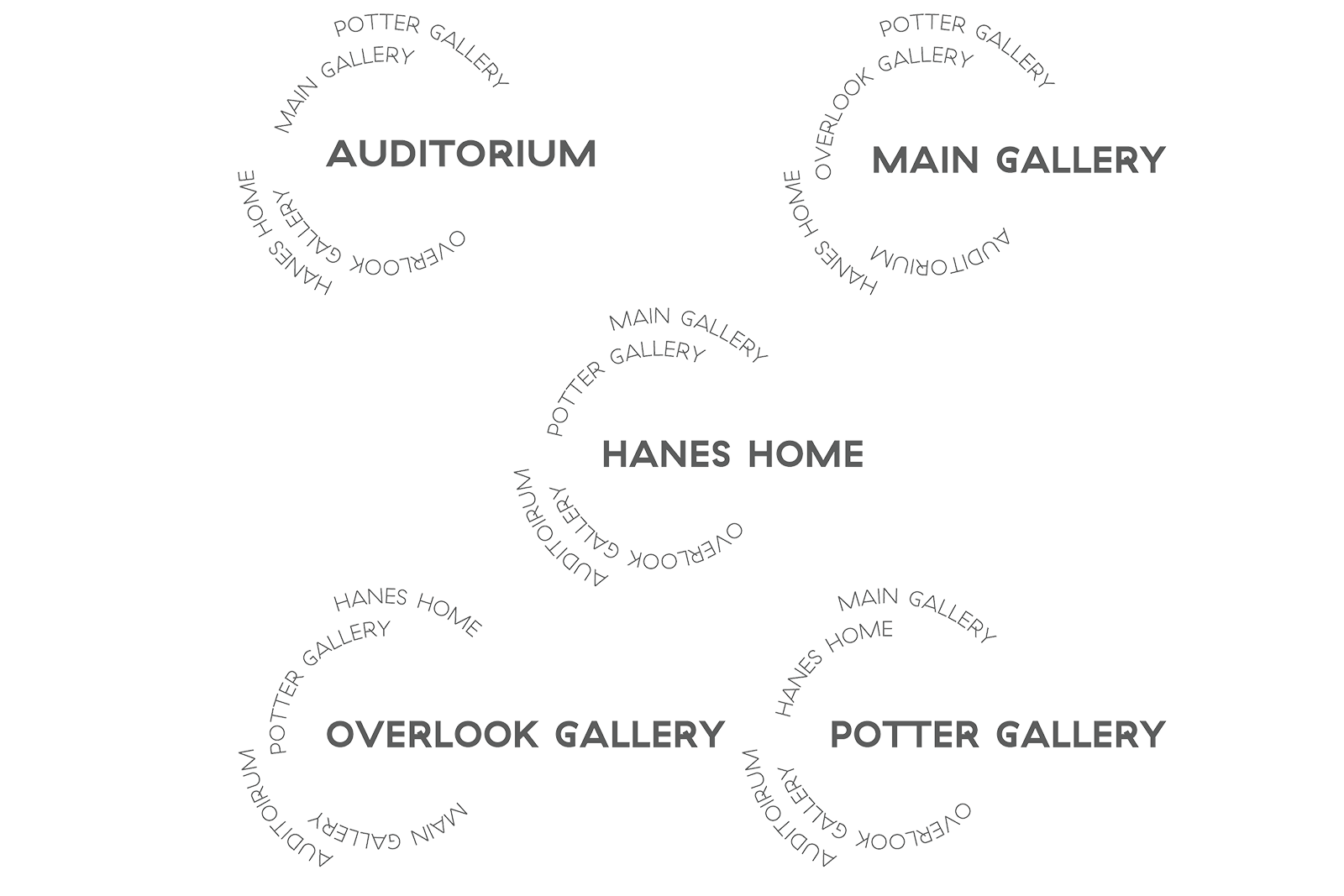
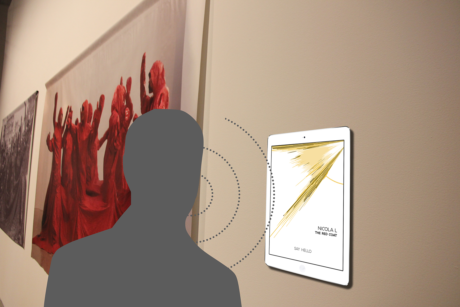
When someone visits SECCA, they will have a slightly different, more participatory experience. When they drive up the waveform is cut into a metal disc that sits on the side of the road. On entrance, the guests are asked to say “Southeastern Center of Contemporary Art” into a microphone and that is printed on their ticket/badge. Their own presence is infused with the brand. All of the wave findings use the ripple of sound to help inform visitors where they are. When a visitor walks up to the learn about a piece of work, they not only can read about the artwork but they can also hear the actual artist talk about the piece. All of these are ways to help represent the voice of SECCA.
April and I presented our proposal to members of New Kind and top-level SECCA administrators and staff where it was recognized for its approach and ideas for the museum.
What happens next…
This project is a little different than some of my others. There isn’t much where I can go back to but I would be interested to see how this branding permeates even more. One being how the website would utilize these branding. All the collateral produced in this project was physical print media, but very few was explored in digital media. I was not exploring virtual reality at the time, but how might a VR experience be used to strengthen the voice of SECCA. This extends into mobile applications, as well.
